01.10.2010
January 10, 2010

Clobber Grotesk Stencil Bold is a new typeface I designed now available through MyFonts. Clobber marries crude stencil forms with extreme legibility/readability at small sizes.
01.09.2010
January 9, 2010

In the last quarter of 2009, we designed and implemented a massive, very code-intensive intranet for the Unilever corporation’s Japan division used to catalog and track market progress. Needless to say, we can’t show anything but the login screen, but it was a milestone for the studio in showing programming flexibility married with good design.
Unilever Japan Intranet
January 9, 2010
当事務所は2009年の最後の四半期にユニリーバ・ジャパンが市場の展開を分類し、経過を追うための集約的なコードを実行する巨大イントラネット網を開発・実装した。
このプロジェクトについてはログイン画面以外一切お見せすることはできないが、当事務所にとっては柔軟なプログラミングと良質なデザインの融合を実現した画期的なプロジェクトとなった。
01.09.2010
January 9, 2010

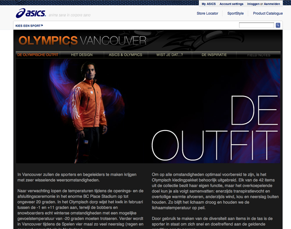
Freshly launched and new in the Web Design section: The Asics Winter Olympics website. The last days of 2009 found me collaborating with the whiz kids at AQ on this content-riddled, photo-driven website for Asics footwear and the Dutch Winter Olympic team. This Dutch language website promotes Asics’ design of the Olympic uniform for the Vancouver Olympics through a lively mix of product imagery, custom animation, facts from history, and bold Native American-inspired graphic design.
Asics X Olympics
January 9, 2010
AQの俊英たちと共同で、Asicsとオランダの冬季オリンピックチームのための画像を中心としつつも読みごたえのあるウェブサイトの制作を行った。
このオランダ語のサイトでは製品の画像、カスタムアニメーション、歴史、そしてアメリカ先住民にインスパイアされた大胆なグラフィックデザインを通じてAsicsがデザインしたバンクーバーオリンピックのユニフォームが紹介されている。
01.07.2010
January 7, 2010

Chomped recently in Portland- Le Pigeon chocolates! Yum!!
01.07.2010
January 7, 2010

Clobber is a new grotesk stencil typeface that will be available through MyFonts and Wordshape shortly. I designed the base forms a number of years ago for a small aluminum furniture manufacturer which they utilized for their branding. I’m currently working on a brand new family for them, so Clobber will shortly be available to the public. The typeface includes a full character set including uppercase, lowercase, figures, and the usual range of diacritics and accents.
12.24.2009
December 24, 2009

Happy holidays from a late night of transcoding, then encoding video and putting together type specimens from long lost typefaces of yore.
Two new projects up in Print + Product: the first season of Open Skateboards and the new Blunt Mechanic CD on Barsuk Records. Very amped on both.
I was just in Chicago doing research for a new article for Idea Magazine and had a bang-up time, diving deep in type history research on my absolute favorite, Oswald Cooper and hanging out with Nate and his sweet kittens, as well as bar Scrabble sojourn action with Aaron.
Thank you, Nate, for the couch space, for being so fricking awesome, and for putting up with my half-assed jet-lagged sleep schedule (though all should note that I got up daily at 8AM latest [!] to drag my ass down to the library. Talk about a Protestant work ethic on a guy, even a reformed Catholic… the lengths some will go to for the love of lettering….).
An extra-large shoutout to Paul Gehl and the tireless staff at the Newberry Library for being such awesome folks. Thank you for your interest, patience, and care. You honor the independent researcher. I salute you!
Open Skateboards
December 24, 2009
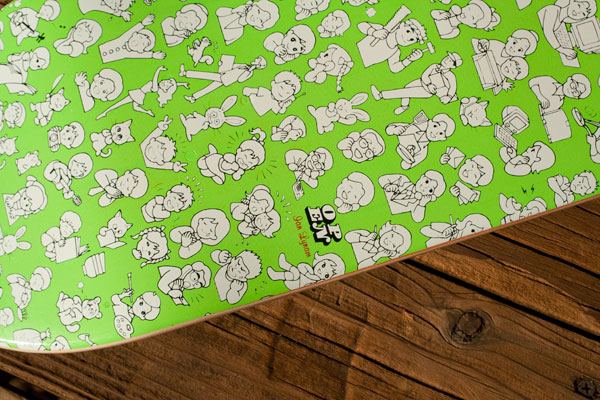
完成までにかなりの時間を要した、Open Skateboardsのシーズンワン。このプロジェクトはちょっとした思いつきがトレバー・サイアス率いる本格的なスケートボードメーカーにまでなったというもの。今回の一年目のシーズンではふたつのデッキを制作した。ひとつはイエン・ライナム・「プロ」モデルで、もうひとつは私の好きな日本人デザイナーのひとりで、昨年亡くなられた故粟津潔に敬意を表したもの。
製造はペンシルバニア州で行われており、超硬質の木にスクリーンプリントを施している(安っぽい熱転写に非ず)。
Blunt Mechanic CD
December 24, 2009
Barsukレーベルから発売されたBlunt Mechanicの新しいCDのデザイン。Blunt Mechanicは元Kind of Like Spittingに新しいメンバーが加わって結成されたバンドで、このデザインの制作にあたっては相当数のイラストを主に電車の中で描くことになった。
それというのもこのCDとまもなく発売されるLP、それにTシャツやスティッカー、ボタンなどのグッズには数百体ものキャラクターが使用されており、東京では電車の中で絵を描いていると、特に良いアイディアを思いついた時や立っている状態で以前使用したものを絞りだそうとしている時に、かなりの奇異の目に晒された。それでも電車が停車している瞬間はチャンスで、その隙にバイキングや有象無象を描くのである。