12.13.2009
December 13, 2009

Lesque’s latest season in the latest issue of Samurai Magazine. New season polished off yesterday and en route to the States to be manufactured.

12.08.2009
December 8, 2009

The Peace Sweater project that I worked on with Ryo Chikushi Bordini, Stefan Sagmeister, Oded Ezer, Dainippon Type Organization, and many others is now available online.

In TAB’s words:
Typography meets fashion with this limited edition sweater with a simple message. Top designers from around the globe contributed the word Peace in their own language, woven together into a harmonious typographic pattern and then printed on a beautifully tailored organic cotton sweater. More than a fashion item, it is an environmental and uplifting statement for a brighter future.
12.04.2009
December 4, 2009
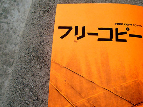
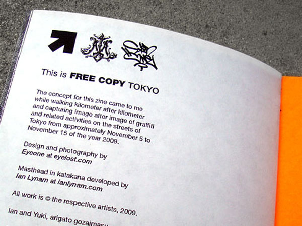
I did up a little katakana treatment of the logo for Free Copy, LA graffiti writer Eye One’s graffiti zine devoted to regional handstyles. He was in Tokyo recently and put together an all-Tokyo issue. You can download the pdf version here.
11.30.2009
November 30, 2009

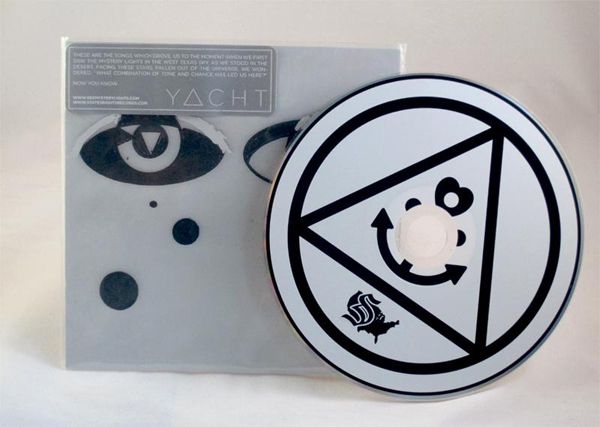
Another one for the archive- Ben from Kind of Like Spitting took this drawing I did in art school and threw it on a record cover.
11.30.2009
November 30, 2009
I have put together this syllabus for my upcoming Typography 101 class at Temple University Japan for those curious as to what the class is comprised of.
PROJECT 1
ON/OFF PROJECT
Develop a concept for a new font whose forms relate to an 8”x 8” square grid. Each box in the grid must be either “on” or “off.” You have no curves or true diagonals. Draw letters on provided graph paper. Consider proportion, weight and structural features such as height of cross bars.
PROJECT 2
ANATOMY OF A LETTER
This exercise will help you to become aware of a letter’s construction: the positive and negative shapes that comprise a letter form make it distinct from other faces. Using various sheets of tracing paper overlay, and colored pencils, trace the letters in various ways to identify and become familiar with the anatomy of type. Include one version that shows ONLY the negative spaces.
PROJECT 3
CLASSICAL TITLE PAGES
Construct a page within an A4 size area using the Golden Proportion (1:1.618). Using only the Title, Author, and Volume text set in Times New Roman and Times New Roman Italic to create very different title pages for J.D. Salinger’s Eleven Stories Volume One. You may not use any ornament or color beyond black and white. You may not “scale” typographic elements – use only the Character and Paragraph palettes and the Selection tool to move objects. Pay detailed atention to the letterspacing, linespacing, kerning, and composition. Make the title pages as sophisticated, thoughtful, and composed with care as you can. Create five by the end of class, then five more for homework. A sample pdf of the work of Swiss master typographer Jan Tschichold is provided to use as reference.
PROJECT 4
CLASSICAL BOOK DESIGN
Construct a classical book layout using the Golden Proportion and a serif typeface. Import text and lay out all eleven stories from the provided Word file using Master Pages to help automate the process. Make the text as readable as possible and clearly define elements (chapter name, folio, etc.).Treat the text with as much care as possible: consider type size, leading, spacing, rag, rivers, widows, orphans, and other typographic errors. Pick your best title page from Assignment 3 and re-work it to fit this book design. An extensive pdf of how to construct Classically proportioned page constructions is provided for reference.
PROJECT 5
MODERN BOOK DESIGN
Construct a Swiss high Modern book layout using a modular grid and a sans serif typeface. Import text and lay out all eleven stories from the provided Word file using Master Pages to help automate the process. Make the text as readable as possible and clearly dene elements (chapter name, folio, etc.). Treat the text with as much care as possible: consider type size, leading, spacing, rag, rivers, widows, orphans, and other typographic errors. Create a modern title page for the book. The title is Eleven Stories Volume Two by J.D. Salinger. A pdf of how to create a modular grid is provided.
PROJECT 6
1–10
The 1–10 project is designed to increase your acumen in assessing typographic, spatial, and graphic hierarchy through iteration. We will be creating a series of typographic posters that will work individually and collectively in order to familiarize you with Adobe InDesign. Details are provided in in-class handouts.
REQUIRED READINGS
Thinking with Type by Ellen Lupton
Chapters 1–4, and 8 of The Elements of Typographic Style by Robert Bringhurst (in TUJ library).
“The Crystal Goblet, or Printing Should be Invisible” by Beatrice Warde [Looking Closer 3] (in TUJ library).
“Typefaces are Rich with the Gesture and Spirit of Their Own Era” by Michael Rock [Looking Closer 3] (in TUJ library).
“Laws of the Letter” by Ellen Lupton and J. Abbott Miller [Design Writing Research] (in TUJ library).
Typographic detailing pages from Type and Typography by Phil Baines and Andrew Haslam (in TUJ library).
11.29.2009
November 29, 2009

I just put together this course syllabus for my upcoming Imagemaking 101 class at Temple University Japan. Just putting it out there for any folks who might be interested in the class to get a better idea of what it is all about.
In the contemporary world of graphic design, designers must be able to not only convey information, but do so in ways that are engaging and entertaining. Imagemaking teaches strategies for creating unique visual form to incorporate into graphic design projects. A hybrid of manual, analog, and digital processes including drawing, collage, manipulating found imagery, pattern-making, and typographic assemblage will be utilized to help students with the goal of the class: for each student to create a 100-page book of a range of form-making styles that will greatly benefit their professional portfolios.
The class will work together to explore different formal and conceptual strategies for creating new and exciting visual illustration. This class will appeal to graphic designers interested in both print and web, illustrators, fine artists, and students with an interest in editorial illustration. It will also appeal to designers and illustrators working within a signature style, as the strategies utilized will help loosen up professionals, push boundaries, and create new work.
This class is a studio class but will require a bit of homework for visual research (collecting source material and light reading). Production time outside of class will be expected to complete the assignments.
Students are expected to attempt form-making experiments outside of the class environment in order to complete the required 50 images that their final books will be comprised of. (Each spread of the book will be one A4 landscape image).
The final two classes will be comprised of assembling our books of imagery while simultaneously finishing projects.
PROJECT 1
FOUND IMAGERY COLLAGE
We will being our exploration of formal study by coming up with a general topic/subject to address throughout the semester. The subject should be something a bit headier than “kittens”, but as long as you can consistently create a series of imagery that explores both literal and non-literal interpretations in a sophisticated fashion, you are good to go.
For this first project, you will put together a mix of found imagery that can be sourced via the internet, photography, clip art, and found in printed ephemera.
Please fill three A4 pages with a collage of your found imagery. Attempt to create a sense of figure/ground relations, scale, and visual excitement with your compositions. Photocopy your three compositions two times. Utilize watercolor paint, markers, or some other forms of color to apply color to one version of your monochrome images.
Feel free to create multiple options if time allows.
PROJECT 2
PHOTOCOPY EFFECTS
Bring 5 iconic, high-contrast images to class. We will use a photocopier to manipulate the images using a variety of techniques in conjunction with the application of halftones and manual reprographic tools.
PROJECT 3
PATTERNS & TEXTURE
Cut black paper into geometric compositions that each fill up a 15mm square. We will scan these, trace them in Adobe Illustrator, and create a collection of patterns with them. We will then take all of the class members’ patterns, combine them into one collection, and each class member will deploy the patterns to make five different geometric compositions.
PROJECT 4
MAKING THE MOST OF PRE-SET PROJECTS
We will utilize preset projects from design tutorial magazines and try to take the pre-assembled projects, remix them, and make them 1000% more awesome. Or at least weirder.
PROJECT 5
TYPE AS IMAGE
We will combine hand-drawn, digital, and analog letterforms using figure/ground relations, scale, and spatial composition.
PROJECT 6
PHOTOGRAPHING COMPOSED ELEMENTS
We will create dioramas of composed graphic elements. Please bring 20 different elements to class to compose into a scene. These can include 3D objects, cut-out paper imagery, or whatever you desire. Feel free to bring a large print of a backdrop image to shoot your elements against.

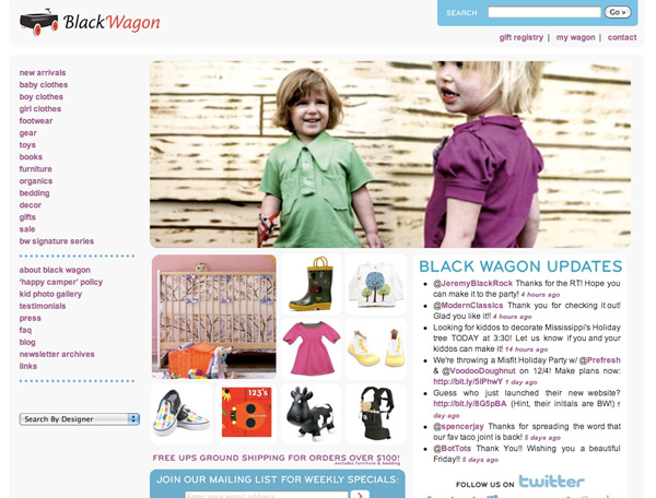
11.26.2009
November 26, 2009

Two years in the making, Black Wagon‘s site launches! Though the website says “Designed by Ian Lynam”, credit is due to Jack Saturn, Sarah Shaoul, and the rest of the Black Wagon team for making it happen.