01.23.2010
January 23, 2010
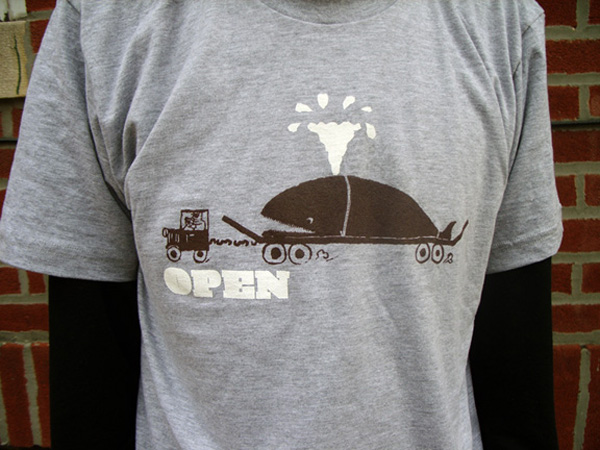
New tee shirt for Open Skateboards, an homage to the late Japanese graphic designer Kiyoshi Awazu. Available for online ordering here.
CNNアウトテイク
January 22, 2010
不定期で、CNNのアジア文化ポータルであるCNNGoに向けて様々なレビューの執筆を行っている。
Wakadaisho

Wakadaisho hosts a collection of vintage skateboard clothing, most exemplary being original Zorlac and Dogtown apparel. Occupying a musty retail space in Shimokitazawa, it’s a time warp for aging skaters.
There is a specific moment in time that Wakadaisho’s wares exemplify: the final days of skateboarding before hip-hop ran over it with a cultural truck. The clothing within the shop is a collection of late 80s skateboard brands- from the sanitary Powell Peralta skull-and—sword-laden imagery to Santa Cruz’s screaming hand imagery to the riskier edginess of Pushead’s stippled skating corpses for Zorlac. This shop is fraught with examples of a time when skateboarding was almost purely a punk rock pursuit, not urban swagger, oversized pantaloons, and Dr. Dre beats. The few skateboards that are within are fish-shaped, not the sanitized, ovoid wooden pills of today.
While much of this visual style has not aged gracefully, some elements have, and this shop is a resource for those interested in surveying the remnants of that time gone by- a time of pool skating, the birth of street skating, bad three chord music, and even worse attempts at creating a new genre of corporate-funded action sports-themed music, namely Thrasher Magazine’s brand of “Skate Rock”.
Along with the vintage skate gear is a sampling of vintage and retro blue jeans, Vision Street Wear sneakers circa 1987, contemporary skate backpacks, and tons of cell phone straps and keychains so integral to doing business in Japan.
Cafe Madu

“What with everyone carrying on about the greater Tokyo Burger Wars, one humble little chain of restaurants has singlehandedly beaten everyone to the punch by crafting the world’s finest BLT.”
I spent the bulk of last year’s Yokohama Triennale being hideously underwhelmed by the art within- the sole exception being Miranda July’s saucy installation in Yokohama’s Akarenga (Red Brick) warehouse complex. After checking that out, I found myself a wee bit peckish and decided to hit one of the restaurants nestled willy-nilly throughout the same warehouse.
Café Madu had a nice veranda, so I decided to give it a whirl. The English/Japanese menu had a fair amount of nice-looking offerings- the usual lunch sets with pasta, salad, and your choice of a beverage, but I eschewed those in favor of a BLT. Japanese BLTs tend to be made with thick Canadian bacon in lieu of North America’s crunchy, day-old normal bacon, making for a solid sandwich instead of a disposable snack.
What appeared before me minutes later was an inspiration- lightly grilled thick-cut bacon, fresh lettuce, a thin veneer of obviously handmade mayonnaise, and the tastiest white bread I’ve ever encountered, toasted to golden perfection. Eating that sandwich was a transcendental moment, it was so damned delicious. And it truly was a moment. I eat fast, frankly, but the sheer force of this sandwich brought about a primal state of ravenous, gleeful consumption rivaled only by sea salt butter caramel ice cream from Berthillon in Paris.
Café Madu’s BLT is the Reign In Blood-era Slayer of sandwiches. It hits you hard, fast, and unrelenting in its mission: to devastate your taste buds, leave your reeling, and just wanting more.
The Study Room

The Study Room is a science-themed shop for the curious child and his/her deep -pocketed parent(s). Young and old alike will be delighted by the broad range of scientific and pseudo-scientific buying opportunities within, guaranteed to be discarded within mere minutes by average children.
As a child, I was infinitely more interested in science fiction and it’s potentialities than any kind of hard science, with the exception being that of a possible future career as an astronaut. Being more of a dreamer than an egghead, those plans were laid to the side over time with a rich mélange of riding BMX bicycles, skateboarding, and listening to weird music taking prevalence over interstellar travel.
One girl that I went to school with was provided the opportunity of going to NASA’s Space Camp late in elementary school. To this day, I have never seen a human’s head become as swollen with self-pride as I saw that summer. This girl would lord her opportunity over us neighborhood kids’ heads all year, taking every opportunity leading up to and following her time at Space Camp to berate us with the details of the experience.
The following year, her folks hit a rough patch financially and in their marriage, and she was not able to go to Space Camp again. She was utterly devastated by her inability to float around in zero gravity, wear silver clothing, and feel so very, very special. This devastation led to her being pounced upon socially by the rest of the herd her age and resulted in daily tears on the school bus for months.
The Study Room’s pricey wares could have a similar effect upon your children, but they are very enticing nonetheless. Magnifying glasses, insect collection cages, skeleton replicas, geodes- all the ingredients for adolescent social leprosy are there for purchasing by the affluent parent with the desire to overcompensate.
Fruits Basket

This Shimokitazawa kids clothing and goods store has some of the best kids gear in Tokyo.
I’ve hit the magical age where ever-increasing numbers of my friends are procreating, both in Japan and abroad. While all good and fine, it means that the number of gifts that I am obligated to purchase for first-time parents is on the increase. With luck, my roaming around the environs of Shimokita landed me in a few decent kids clothing and accoutrement stores, though Fruits Basket stands out from the crowd.
Sometimes you just need a little something special for your friends’ imminent progeny.
For example, my friend Mort works as a garbageman (http://thankyoume.blogspot.com/) in San Francisco. Mort’s got a big mouth, a lot of charisma, and he lives in a fairly terrible ghetto in Oakland. He’s one of the only white people on his block, and as his wife is white, I assumed (properly, it turns out) that their first child would also be white.
I found the perfect shirt at Fruits Basket for their incoming offspring: a onesie bearing this dubious slogan in 120 point Futura, “I am a black man”. Perfect when paired with a sleuthily stunning extra-small Shelock Holmes-style cap for baby at a reasonable ¥4000 for both.
Morton now receives regular beatdowns on America’s mean streets as his child looks on in vaguely racist clothing. You too can live the fantasy.
01.21.2010
January 21, 2010

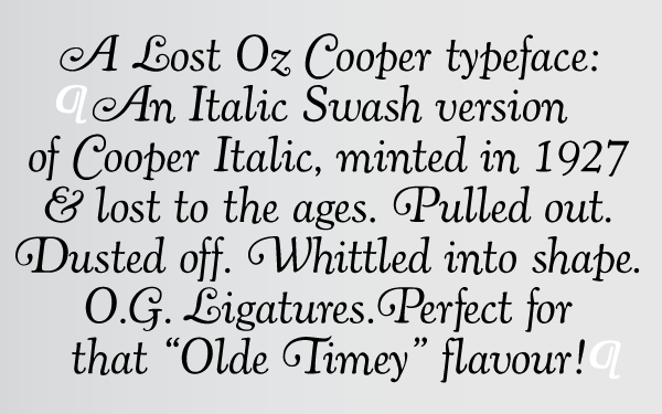
Just released via MyFonts, my latest typeface release is the definitive version of Oswald Bruce Cooper’s great lost typeface Cooper Fullface Italic.
At the end of 1927, Oswald Bruce Cooper yearned to create a heavy “modern” face- akin to Broadway and other display types in height and proportion, but more nuanced while being a dense, black type. The Barnhart Brothers & Spindler foundry, for whom Cooper had designed a number of typefaces, saw the potential of the typeface as a big seller. Richard McArther, General Manager of the foundry, referred to it as “the hotsy stuff”, though he was highly critical of a number of characters in the original design. He requested a successive number of modifications, including the addition of Dwiggins-inspired serifs to the face to make it stand apart from similarly-weighted typefaces then on the market. He wanted to imbue the face with a considerable amount of “old-timey” flavor in order to impart a sense of originality to the face and have it sell across both Modern and Bodoni/Didot market segments.
The resulting typeface was called Cooper Fullface, a jaunty and swollen caricature of a Didone with great potential for display advertising work. The final form of the face was a regulated and consistent balance of cartoonishness and earnest visual braggadocio, the bouncy, circus fairway-like swing of the original drawings of the letters taken down considerably and figures redrawn and redrawn for maximum readability.
A specimen sheet was mailed out in 1929, and generated moderate sales, but too late- Barnhart Brothers & Spindler closed its foundry division shortly thereafter as part of ATF’s corporate roll-up of manufacturing. The American Type Founders continued to produce the face and sell it at a decent pace, renaming it Cooper Modern.
Cooper designed a matching italic for Cooper Fullface, but it was never released. The BB&S foundry closure resulted in the foundry equipment being shipped to New Jersey a few weeks shy of the typeface’s completion. It is unfortunate, as the accompanying italic is perhaps Cooper’s masterpiece, a lively Bodoni-esque italic with more than a bit of influence from 19th Century display types, particularly in the treatment of the ball serifs on the uppercase “A”, “J”, “M”, and “N”. Cooper Fullface Italic stands as the until-now missing bookend to Cooper’s career as a type designer.
This digital release is the revival of that lost Cooper typeface, Cooper Fullface Italic. Within are two typefaces- Cooper Fullface Italic and Cooper Fullface Italic Fancy. The two faces span the range of Cooper’s original drawings- the Fancy typeface utilizing a number of alternate characters.
These two typefaces are the result of researching Cooper’s original drawings and series of engraved proofs for both typefaces. The typefaces include the original ligatures, original Oz Cooper ornaments, fancy swash characters, and a range of punctuation and diacritics, et al, that fill out a full character set. The typefaces have been lovingly kerned for the smoothest result in text setting.
Available via MyFonts.
01.20.2010
January 20, 2010

New logo for Grasshut Corp. in Portland, Oregon.

New typeface design for Simon Vickers called Sounds of English. SOE is a phonetic typeface based on English pronunciation.

New tee shirt graphic for Los Angeles’ Anarchist Book Fair.
01.16.2010
January 16, 2010
Two new font releases on MyFonts this week.
The first is the definitive version of Oswald Bruce Cooper’s classic typeface Cooper Italic.
1924 saw the release of Cooper Italic, the italic companion to Cooper Oldstyle. Cooper Italic possesses “a most unusual swing” in a number of the characters, most specifically the scooped, pigeon-toed feet of the lowercase “n”, “h”, and “m”. These idiosyncratic characters are offset by more stately and assured capitals. Cooper said that his Italic is “much closer to its parent pen form than the roman” and “that freedom is almost the life of it”.
Cooper was a firm believer in creating humanist letterforms that echo the hand that created them, not wringing the life out of them through refinement and mechanization. In Cooper’s own words about Cooper Italic, “The designer is conscious of its crudity, and of its irreverence for the best traditions. But he believes that there are enough good types already– that the need is for poor types that can be used! And since he admits this to be a poor one, there now remains to be found out only whether it is usable or not.” Cooper was long a believer that good type should be homely- if too pretty or sleek, it’s lifespan would be exponentially shortened.

Cooper designed a set of swash capitals to pair with Cooper Italic in 1927 that had not been released until now. The swash capitals are a lively interpretation of round serifed oldstyle caps mixed with classic Caslon italic forms.
These two typefaces are the result of researching Cooper’s original drawings and series of engraved proofs for both typefaces. The typefaces include the original ligatures (never before released digitally), the previously unreleased Swash characters, and a range of punctuation and diacritics, et al, that fill out a full character set. The typefaces have been lovingly kerned for the smoothest result in text setting.
Cooper Italic Complete is available from MyFonts here.
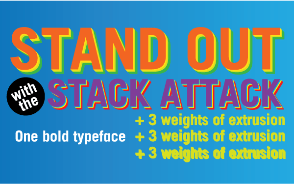
The second typeface release is called Stacker. Stacker is a display gothic typeface with three weights of extruded typefaces that can be used to project the main typeface spatially.
Originally designed for Beautiful/Decay magazine, then picked up for Nokia’s 2006 Europe campaign, Stacker is a bold, lively, attention-grabbing display face.
The extruded faces can be used in a standalone manner, as they have been by electronic musicians such as YACHT and E*Rock.
Stacker is available from MyFonts here.
01.13.2010
January 13, 2010

Last chance to sign up for Typography 101 at Temple University Japan.
The course has been expanded to include designing custom typefaces and programming digital fonts from them.
01.12.2010
January 12, 2010

Updates site-wide! Above, Xmas ornaments for YACHT, included in the big YACHT update in the identity section.

Also in there, fitted cap for YACHT/the Fader. Collaboration with Jona Bechtolt of YACHT.

Poster, audio tour CD and booklet cover design for Portland’s Dill Pickle Club in the publication section.

Redesign of Microcosm Publishing’s zine compilation book 13 Years of Good Luck in the Publication section.
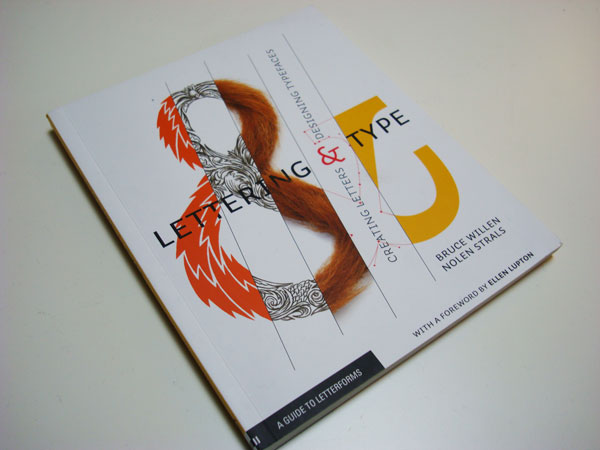
Logo design published in Post Typography’s book Lettering & Type Design, published by Princeton Architectural Press.

Previously mentioned, but not shown, CD and poster design for Blunt Mechanic (ex-Kind of Like Spitting) on Barsuk Records.
Dill Pickle Club WPA Projects
January 12, 2010
ポートランドのDill Pickle Clubが発行する1920年代の大恐慌時代に雇用促進局が出資したポートランドの公共事業についてのオーディオツアーCDと書籍のポスター、本の装丁、そしてCDのレーベルデザイン。
13 Years of Good Luck
January 12, 2010
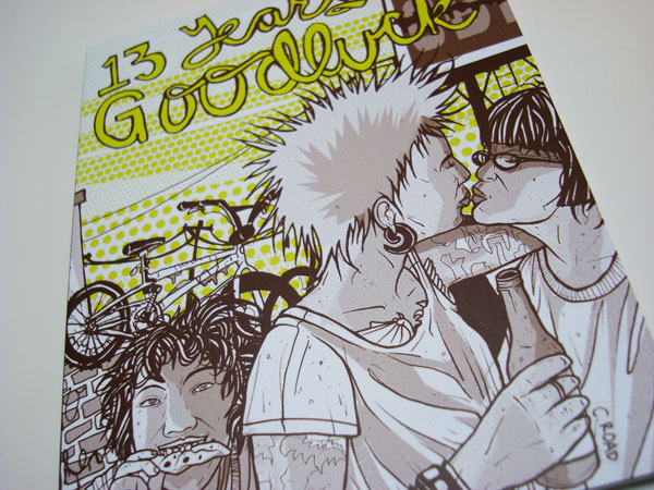
Microcosm Publishingの非営利雑誌の総集編、『13 Years of Good Luck』のリデザイン。表紙イラストはクリスティー・C・ロード。
今回のリデザインでは画像と文章の大部分を再構成し、中表紙とタイトルページに書体様式を設け、全体的な雰囲気にも磨きをかけた。この総集編では、今日のDIY同人雑誌においてもっとも人気の高い面々が特集されており、しかもお値段はたったの1ドルと実にお買い得である。