07.06.2010
July 6, 2010
アイデア #341
July 5, 2010

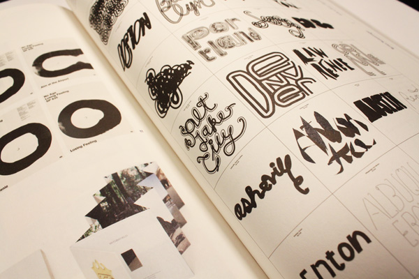
クリティカル・マス
構成: イエン・ライナム+アイデア編集部
グラフィックデザインにおける現代の決定的な慣習を探る記事であり、マーク・オーウェンス、ザック・カイズ、ジョン・スエダ、ブライアン・ロッティンガー、ダニエル・イートック、スコット・ポニック、マイケル・ウォーシントン、ヤスミン・カーン、メタヘイヴンを特集。
Subterranean Modernism: A Critical Retrospective (地下にあるモダニズム)
文: ランディ・ナカムラ+イエン・ライナム
On the Uselessness of Design Criticism (デザイン批評の無用さについて)
文: ランディ・ナカムラ


06.21.2010
June 21, 2010

One podcast I have a particular affinity for is NPR’s Planet Money. They recently had a show about tee shirts, which was basically a giant intro to a pitch to their listeners to participate in a graphic design contest to make, surprise surprise, a Planet Money tee shirt.
This is my submission, which just went out via email to the show.
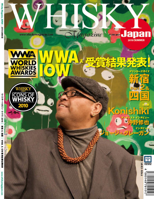
Above is legendary sumo wrestler Konishiki with the live painting that I made for Whisky Live 2010 at Tokyo Big Sight a few months ago. The big guy and I chatted over a live broadcast for Japanese TV after I interpreted the taste of some Scottish whiskey in painted format for 90 minutes.

Interview coming in the next issue of Whisky Magazine Japan. Thanks to Julia Barnes, Clint Taniguchi, and David and Dave at Whisky Mag!
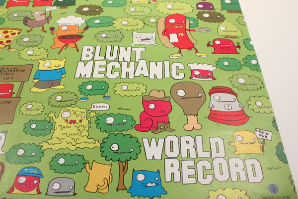
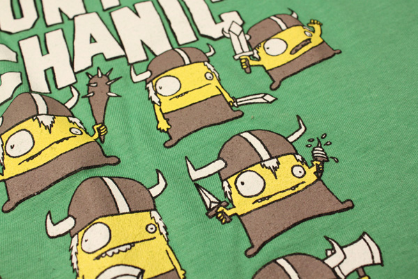
Blunt Mechanic
June 18, 2010

Blunt Mechanic(旧Kind of Like Spitting)のための新しいTシャツデザイン。彼らのアルバム『World Record』のジャケットを飾ったバイキングたちが、ライムグリーンのTシャツに黄色、白とグレーのカラリングで再登場している。お求めはこちらからどうぞ。
How To Pick Locks Vol. 2
June 18, 2010
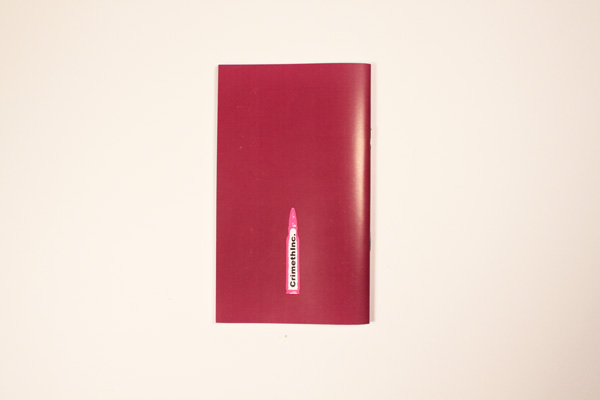
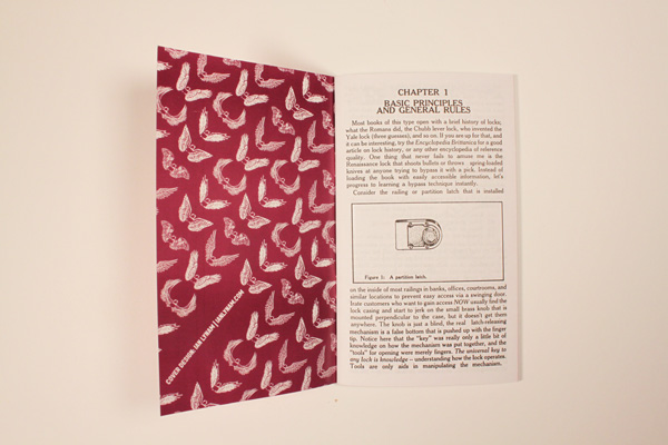
Crimethincから出版されている『A Guide To Picking Locks Volume Two』のカバーデザイン。
06.18.2010
June 18, 2010
Critical Mass
Compiled by Ian Lynam + Idea magazine
An inquiry into contemporary critical practices in graphic design featuring:
Mark Owens, Zak Kyes, Jon Sueda, Brian Roettinger, Daniel Eatock, Scott Ponik, Michael Worthington, Yasmin Khan, Metahaven
Subterranean Modernism: A Critical Retrospective
By Randy Nakamura + Ian Lynam
On the Uselessness of Design Criticism
by Randy Nakamura
You can pick up a copy here.
Also new:
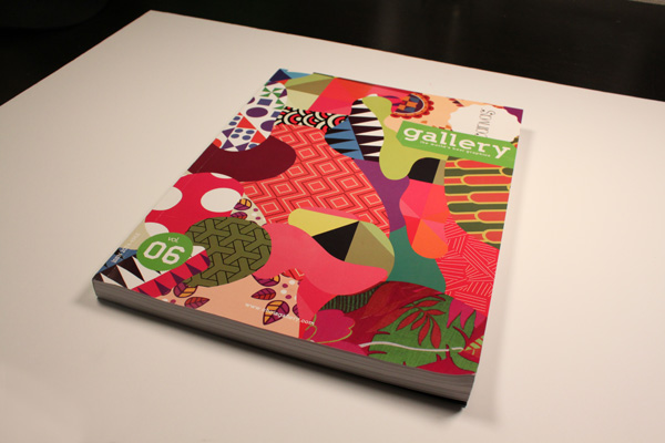
I have a handful of projects featured in the new Choi’s Gallery Magazine.

New shirts out for Blunt Mechanic.

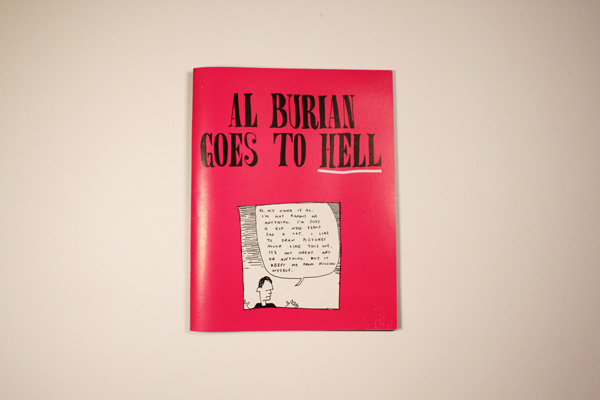
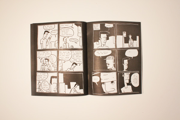
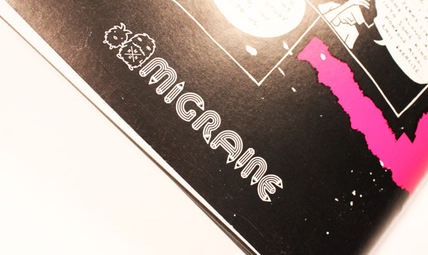
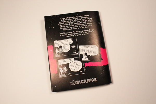
Also new: Migraine, my decade-dead publishing imprint resurfaced from the grave this month to release an illicit edition of Al Burian’s comic Al Burian Goes To Hell. All I can say is that I was responsible for the design, and that I hope Al doesn’t kick my teeth in.
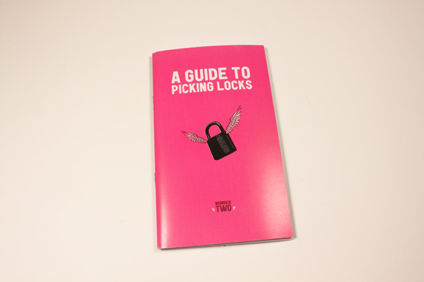
Now out: A Guide To Picking Locks Volume Two, published by Crimethinc. I designed a snazzy two-color cover for this second volume, picking up where I left off with Volume One.
06.14.2010
June 14, 2010

New typeface release from Wordshape/MyFonts:
Cooper Black Condensed is a less wide, but not squished variation on Cooper Black.
The history of this typeface:
Cooper Black, the most famous and successful of Oswald Cooper’s type designs was released in 1920, following a year of development fleshing out the weight of the typeface and filling out the full character set. Cooper redrew the lowercase characters multiple times, toying with the rounded forms of the “m” and “n” and engaged in a lively debate with Barnhart Bros. & Spindler’s General Manager Richard N. McArthur over the final form as McArthur requested that the typeface be drawn bolder and bolder. Cooper famously said the face was “for far-sighted printers with near-sighted customers”, and the public agreed. Sales of Cooper Black were voluminous, and Barnhart Brothers & Spindler had a difficult time keeping up with the demand for the typeface. Conservative typographers were critical of Cooper Black, though it was overwhelmingly popular, helping to shape the American advertising landscape through the 1920s and 1930s.
1925 saw the release of Cooper Black Condensed, a “condensed but not squeezed” variation on the Cooper Black theme. McArthur and Cooper had the usual lively back-and-forth over the shapes of some of the letterforms, in particularly the uppercase “Q”, resulting in a thoroughly accomplished alphabet. The first showing specimen of Cooper Black Condensed compared the new face with Cooper Black, showing that it was 20 less wide and that it promised to “show something of gentility while being able to spit on its hands and make itself useful”.
This typeface is the result of researching and faithfully redrawing characters from Cooper’s original drawings and series of engraved proofs for the typeface. The typeface includes the full range of punctuation and diacritics that fill out a full character set. The typeface has been lovingly kerned for the smoothest result in text setting.
06.06.2010
June 6, 2010

My type foundry, Wordshape, released a new typeface this week: Interno.

Interno is a headline typeface built from a Walter Ballmer Olivetti logo exploration drawn sometime in 1960. Work on Interno commenced in 2006 by Eli Carrico, but was soon abandoned. In 2009, Eli picked it back up and ran with it, completing Interno 1. I picked through Eli’s development stages of the typeface and edited together a slightly different version, Interno 2, utilizing a mix of development characters and original characters.

Interno is Italian for internal (or at least that is what the translation widget told us). A great deal of the classic Olivetti design was down in-house (i.e. internal). Also, the typeface has internal switchbacks reminiscent of a paperclip. Interno sounds a bit like “turning inside” phonetically(In-Turn-O). Additionally, Interno takes the first letter and last letter of Olivetti and flips it.

Available now via Wordshape/MyFonts.