12.06.2010
December 6, 2010

I’ll be participating in a really interesting event in Osaka this weekend- an overview of the work of Schtücco, the Tokyo-based graphic design and typography office run by Akiyama Shin. On December 11th at 8pm, I’ll be interviewing Shin onstage about multilingual typography and the development of his design office, as well as its calculated death, as Shin is retiring from the graphic design profession (at least for now).
A super-accomplished typographer, designer and art director, Shin has steered his office through the creation of innumerable projects for cultural clients in Japan and abroad, taking home the Leipzig book award no less than twice.
The interview and accompanying exhibition of a lifetime of graphic design work takes place at Pantaloon in Osaka.
If you are in town, I’d venture that it will be the graphic design event of the year in terms of getting context on an award-winning, comprehensive graphic designer from the 1980s through today.
Roommate, conspirator and fine art photographer Patrick Tsai will be having an exhibition in Osaka this weekend, as well, so no better time to get some visual culture in than Saturday! (Excellent interview with Patrick by Cameron McKean here.)

I’ve been doing a rash of talk shows/on-stage interviews as of late. This past weekend, I spoke about the work of Tokyo-based oil painter Akira as part of a Scotch Malt Whisky Society event called Ménage à Trois which assessed the triumvirate of whiskey, cocktails and fine art. The event was produced by Nonaca in collaboration with Whisk-e, and was an utter smash!
12.03.2010
December 3, 2010

Out now: Designer’s Whisky- a duo of fantastic Scottish whiskies from Japan/Uk spirits importer/exporter Whisk-e that I designed the labels for.

One is a 13 year old Bowmore from Islay.

The other is a 10 year old Caol Illa.

Both will knock your socks off- premium whiskies in bespoke packaging that is a mix of custom patterns, Wordshape fonts, and modern layouts.
Huge thanks to David Croll for the chance to collaborate.

Also, available now via MyFonts/Wordshape: Hanger.
Hanger is a limited character display typeface. Based on the shapes of the alphabet if made out of a bent wire hanger, Hanger is suitable for apparel design, merchandising, and identity design projects.
11.29.2010
November 29, 2010
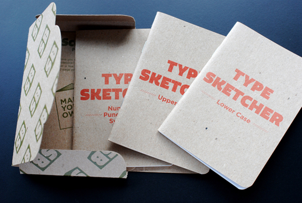
Really nice thoughts on the Type Sketcher project from Akira Kobayashi, the type director of Linotype.
I got to spend some time with Akira last month one-on-one for the first time. We’ve been in contact for a few years, as I interviewed him for PingMag ages ago, as well as for my book, Parallel Strokes. We met up at TypeCon in Los Angeles earlier this year, then finally sat down and chopped it up in Ebisu a few weeks ago. He brought along an original print that uses Caslon’s O.G. grotesk for discussion, and we talked about the state of typography and typographic education in Japan.
A few days later, I caught his presentation on Japanese folks working in the arts and industry of lettering and type design outside of Japan at Aoyama Book Center. It was quite engaging- covering the work of Kunihiko Okano and a number of others.
I can’t emphasize how important Kobayashi-san is as a connecting force in the world of graphic design- he brings people together from all over the world with a maximum of kindness and openness. Japan needs more informal ambassadors out in the world to help push design and design education.
Onitsuka Tiger “Aisen”
November 28, 2010
藍染めを使用したオニツカタイガーの新しい靴コレクション、「AISEN」のブランドビデオ。こちらで動画を見ることができる。
11.28.2010
November 28, 2010

Little Bird, the fledgling sister restaurant to Le Pigeon, Portland, Oregon’s crown prince of restaurants, opens next month. We’ve been furiously working away creating a bespoke, yet related identity system for the restaurant including menus, signage, @font-face-powered website, business cards, and a ton of surprises.
Little Bird opens on December 8- same day as my birthday. Couldn’t get a nicer gift!
11.26.2010
November 26, 2010

Out now: Slanted Magazine #12– a whole issue of the Berlin-based design magazine dedicated to Women, Typography and Graphic Design.

For this issue, I contributed my second essay installment toward understanding Japanese typography, as well as interviews with Susanna Baer of so+ba and Akiko Kanna, two of the most talented graphic designers working in Japan today.


11.25.2010
November 25, 2010

New kisekae mobile device theme for W+K TokyoLab available now for your phone. Just navigate here using your phone to download.
11.25.2010
November 25, 2010

One more Pecha Kucha Night presentation down! Lots of free designed goods distributed to the people. Mega-thanks to Hisae for the awesomest co-presenting!
11.22.2010
November 22, 2010

Hisae and I will be presenting the Year In Review- a bilingual roundup of project highlights, as well as giving away a grip of free stuff, at Pecha Kucha Night on Wednesday in Tokyo.