12.24.2010
December 25, 2010

Big news for the end of the year: my type foundry Wordshape is now offering a selection of typefaces for use on the web. That’s right- full web-fonts for online deployment using @font-face. No better Xmas gift for the web-savvy designer in your life than a web font!
Check out the selection here!

12.23.2010
December 24, 2010

I’m pleased as punch to have shot some images of Portland’s newest fine dining establishment, Little Bird.

The understated, French-inspired identity we designed for the restaurant came out really nicely across business cards, menus, signage and assorted print ephemera.

Congratulations to Paul, Andy, Gabe, and the other partners in the venture. The restaurant looks beautiful and the food is amazing!


12.23.2010
December 24, 2010

My album design for Blunt Mechanic was just featured in the article 90 Notable Album covers from 2010 over at Redefine Magazine.
12.22.2010
December 22, 2010

I have a one-of-a-kind print in the ROM: Space Knight exhibition up at Floating World in Portland, Oregon at present.
The exhibition is a fundraiser for ROM creator Bill Mantlo. You can bid on the print here. The proceeds of sales of the exhibition prints will be directly donated to Bill.
ROM was one of my favorite comic books as a kid, along with Micronauts, Mantlo’s other masterpiece. These series synthesized the perfect balance of late 70s comics- dense story lines, compelling characters, and enough romance to make adolescents feel the onset of puberty encroaching. Amazing, thought-provoking work.
On July 17, 1992, Mantlo was struck by a car. The driver of the car fled the scene and has never been identified. Not wearing a helmet at the time, Mantlo suffered severe head trauma. According to his biographer, David Yurkovich in 2006, “For a while Bill was comatose. Although no longer in a coma, the brain damage he suffered in the accident is irreparable. His activities of daily living are severely curtailed and he resides in a healthcare facility where he receives full-time care.”
In 2007, cartoonist David Yurkovich released the benefit book Mantlo: A Life in Comics, with all proceeds from the book donated to Mantlo’s brother and caregiver, Michael Mantlo, to help toward the costs of maintaining Mantlo’s care.
On December 6, 2007, the Portland, Oregon, comic-book shop Floating World Comics sponsored “Spacenight: A Tribute to Bill Mantlo”, an art show made up entirely of various artists’ interpretations of ROM, to help raise funds for Mantlo’s care.
This exhibition is the next installment of this exhibition series.
12.21.2010
December 22, 2010

It’s been an interesting week- just finished up a short project helping Fostex with the naming for their new “201” collection of Kotori customizable headphones.

With recent forays into strategy for other brands, as well as holistic identity projects that extend into writing and naming, the scope of what the studio accomplishes feels both more comprehensive and more gratifying.

Thanks to Yuki and Chiemi at IMGSRC for the chance to collaborate on an interesting foray into brand identity.

If you aren’t familiar, the Kotori brand of headphones manufactured by Fostex are pretty much the hottest headphones out there- fully customizable earbuds and Dj headphones with thousands of color combinations. Imagine if NikeID was as rad and customizable as they purport to be. Sadly, available only in Japan.

12.20.2010
December 21, 2010

I was just interviewed in English and Italian for the Milan Triennale Design Museum / La Triennale di Milano Design Museum by Alice Twemlow, Chair of New York’s School of the Visual Arts’ Design Criticism Department. The interview is featured in A Diary of an Exhibition– the logbook of Graphic Design Worlds, the exhibition that will open in January 2011 at the Triennale Design Museum in Milan.
Curated by Giorgio Camuffo, the exhibition will display the multifarious worlds of graphic design by featuring the work, the ideas and the stories of some of the most interesting designers in the contemporary international scene.
Featured on the blog are texts, interviews, videos, pictures, and photographs, as well as thoughts and considerations, that provide a look behind the scenes of the making of the exhibition.
Read the interview here.
12.15.2010
December 15, 2010

I just had some work published in a new book of identity design. Details from the publisher:
Designers’ Identities, by Liz Farrelly and published by Laurence King in November 2010 showcases the corporate identities of 76 designers, at various stages of their careers and from around the world, providing blueprints for best practice and inspiration.
For graphic designers no project is more personal or more crucial, both in terms of commercial success and peer-group positioning, than their own corporate identity. From the first hello, to delivering the invoice, designers are judged, again and again, on the quality of their printed and virtual presentation. This includes their
company name, logo, business card, letterhead, website, blog, newsletter, delivery packaging, brochures, promos, even the typeface they choose.
Along with detailed information about formats, materials and methods, the book includes a number of interviews with designers, who talk through their own corporate identity programme and the reactions they have had to this, their most
personal design project.
Details:
350 colour illustrations
290 x 210 mm
272 pages
Paperback
Full overview here.
Nonaca
December 13, 2010
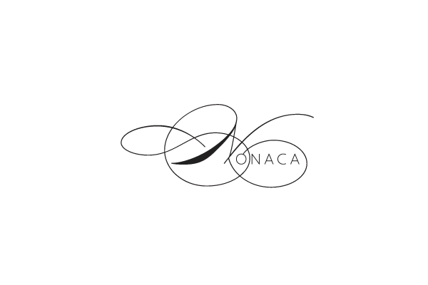
東京のアートプロダクション会社、Nonaca LLCのロゴ、書体規格、配色規格、印刷物やウェブサイトからなる総合的なアイデンティティデザイン。
WKTokyoLab “Wagara”
December 10, 2010
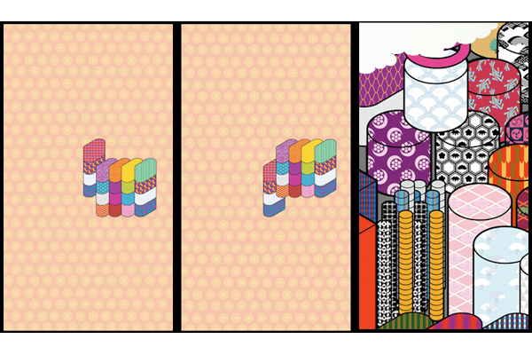
こちらはW+K東京LABの携帯ショップのために制作した新作の携帯きせかえテーマ。きせかえテーマとは、ユーザーがダウンロードすることで携帯電話の総合的なテーマとして使える画像セットのこと。
12.08.2010
December 8, 2010

The new issue of Idea features an interview with design legend Karel Martens, which I edited.