Lurker II
January 31, 2011
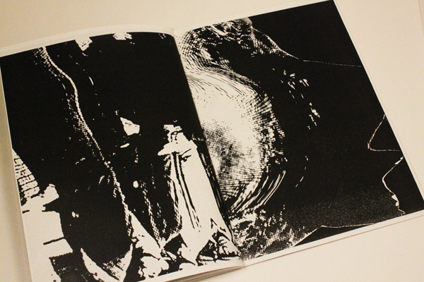
実験的なフォルム構成についてのzine(ジン)。限定10部を制作。
01.30.2011
January 30, 2011

New font release! Cooper Black Swash is a luscious swash version of the American type design classic, Cooper Black.
The history of this typeface:
Cooper Black, the most famous and successful of Oswald Cooper’s type designs was released in 1920, following a year of development fleshing out the weight of the typeface and filling out the full character set. Cooper redrew the lowercase characters multiple times, toying with the rounded forms of the “m” and “n” and engaged in a lively debate with Barnhart Bros. & Spindler foundry Manager Richard McArthur over the final form as McArthur requested that the typeface be drawn bolder and bolder. Cooper famously said the face was “for far-sighted printers with near-sighted customers”, and the public agreed. Sales of Cooper Black were voluminous, and Barnhart Brothers and Spindler had a difficult time keeping up with the demand for the typeface. Conservative typographers were critical of Cooper Black, though it was overwhelmingly popular, helping to shape the American advertising landscape through the 1920s and 1930s.
Cooper released swash characters for his popular Cooper Black Italic, but never an upright set of swash capitals. A number of prototype versions appeared in the 1960s and 1970s, though none have been ushered into the digital age. Cooper Black Swash has been created in the spirit of Oz Cooper’s work and is a design that we believe he’d be quite pleased with!
Available as a webfont, as well!
01.17.2011
January 17, 2011

Micke Thorsby/PMKFA will be lecturing tomorrow in my Computer Imaging class at Temple University Japan at 2:45 PM in Room 507 at Azabu Hall. Guests are welcome! Directions are here.
Cooper Screamers
January 14, 2011

先日「スクリーマー」 -巨大なイタリック体の感嘆符で、かつてはアメリカのタイポグラフィ業界特有のものだったが、今では正式に使われているのは日本だけだと思われる- についての記事をNeojaponismeに寄稿した。これはその際に、併せてWordshapeから発売したオズ・クーパーのデザインによるスクリーマーのセット。

Cooper Screamersのダウンロード、お求めはMyFonts/Wordshapeからどうぞ。
Slanted #12
January 14, 2011


Slanted #11
January 14, 2011


01.14.2011
January 13, 2011

New project in the Identity section of the site, a full identity for Saga, a swimwear company based in San Francisco.


Chainbreaker
January 13, 2011
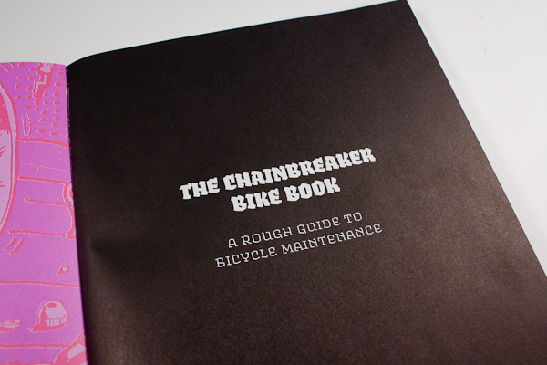
手描きイラスト入りの初心者向け自転車修理マニュアル『Chainbreaker』のリデザイン。この本の共同執筆者たちは、ニューオーリンズの様々な自転車屋で働いて蓄積した豊富な知識と経験を未来のメカニックたちに教えてくれている。
この本の前半は、自転車を選び、修理し、乗るための完全な修理マニュアルで、後半はハリケーン・カトリーナによって原本が失われた同人誌『Chainbreaker』の4部からなる再版となっている。
01.13.2011
January 13, 2011

I created the template and typographic standards for The Zinester’s Guide to NYC by Ayun Halliday, published recently by Microcosm Publishing.
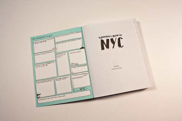
Joe Biel did the production and all of the heavy lifting while Nate Beaty held down the cover design and illustration.


