Poster Initiative 012
September 30, 2011
自主制作ポスターシリーズの更なる新作は、私と芸術家のブワナ・スプーンズとのコラボレーション作品。ブワナが描いた帽子を被った猫に私の描いた羽根のあるモグラをコラージュしている。印刷には二色のスポットカラーを使用。
Poster Initiative 011
September 30, 2011
自主制作ポスターシリーズの最新作。ファウンド・アート的なものと手描き/合成画像を使用した抽象的な構成が特徴。印刷には三色のスポットカラーを使用。
09.22.2011
September 22, 2011

This is a title treatment I did a bit ago for a new short film starring pal Jai West of Survive Style 5+ fame. Coming to the big screen soon…
09.22.2011
September 22, 2011
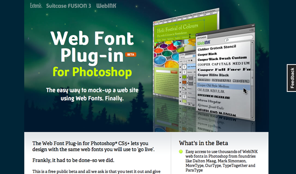
Wordshape fonts featured in Extensis’ latest extension of its WebINK web font service. Exciting!
Catalogue Heritage
September 21, 2011

雑誌『Néojaponisme』に、初期の日本のモダニズム、および、オニツカタイガーのプロモーションのデザインがいかに日本のデザインの歴史の連続体にフィットしたのかに関する新しいエッセイを寄稿。
09.21.2011
September 21, 2011
I wrote a new essay for Néojaponisme about early Japanese Modernism and how the design of promotions for Onitsuka Tiger fits into the continuum of Japanese design history.
09.19.2011
September 19, 2011

A set of the two label designs I did for Whisk-e last year. You can obtain the whiskeys here for a stunningly affordable price. The 13-year Bowmore is delightful, in particular. To have designed packaging for something of this quality is mind-boggling to me.
09.13.2011
September 13, 2011

Nice new business cards for Joshu + Vela in San Francisco.

09.06.2011
September 6, 2011

A quick update on my lecture tour in the U.S. in early October:
He walks. He talks. He projects his voice and waves his hands around! Glib, incisive commentary on Japanese typography, recent projects, writing on graphic design, and the state of Design in Japan today.
- October 4, 5PM at CalArts (California Institute of the Arts), Valencia, CA
- October 5, 5PM at Otis College of Art & Design, Los Angeles, CA
- October 6, 12PM at Portland State University, Portland, OR
- October 10, 7PM at California College of the Arts, San Francisco, CA