04.08.2012
April 8, 2012

Also, I was recently interviewed by the nice folks over at ID Institute in Germany. Read it here.
04.08.2012
April 8, 2012

I co-edited and contributed a few essays to Idea Magazine‘s new feature about New Wave/PostPunk independent publications, on newsstands any day now…

One is called “Dot Gain” and is an introduction to independent publications in the late 70s and the early 80s.

The second is a hybrid essay/interview with WET magazine founder Leonard Koren about WET and his life and times.
Special thanks to Mark Dytham and Astrid Klein for their assistance in researching the essay!
04.04.2012
April 4, 2012
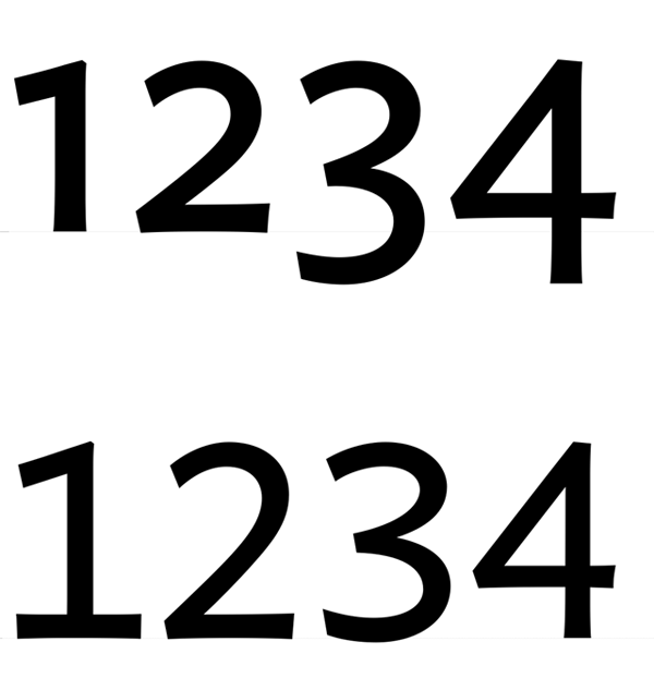
Just did a quickie project for the notorious Tokyo Art Beat: some quick OpenType scripting to swap out lining numerals for non-lining numerals in their house font.
03.27.2012
March 27, 2012

An oldie but a goodie: my typeface Rubber Vloeren in use in a commercial by Brand New School for the American National Pork Board circa years ago. See it here.
03.24.2012
March 24, 2012
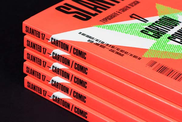
I have a whole heap of writing in the new issue of Slanted Magazine. My dear friend and roomie Patrick Tsai is featured, as well.
Lesque Junichi Arahata
March 24, 2012
Lesqueのための最新のデッキグラフィックがこちら、荒畑潤一のプロモデルの最新作。私の書体、Pompeian Cursiveが使用されている。
03.24.2012
March 24, 2012

My latest deck graphic for Lesque just came out- it’s Junichi Arahata’s latest pro model. In use: my font Pompeian Cursive.
03.21.2012
March 21, 2012
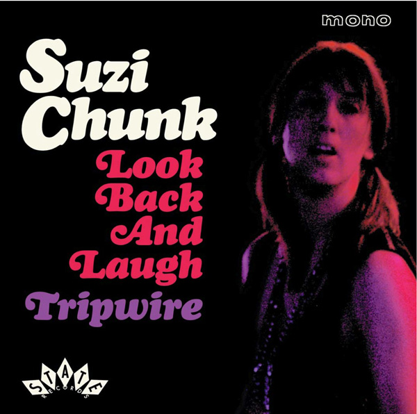
I received a few samples of recent projects done by Bruce Brand of the fabulous Arthole in the mail- excellent examples of my Wordshape fonts in use! Bruce has done tons of great design work for folks like Wreckless Eric, The Whites Stripes, Thee Headcoats, The Darkness and others.
Lava Dome Media
March 20, 2012
オレゴン州の本の出版Lava Dome Mediaのロゴとアイデンティティ。
