06.11.2011
June 11, 2011

The new fonts I designed for Onitsuka Tiger, Kirimomi Geometric Sans and Kirimomi Swash, are featured in the new issue of Idea Magazine (the primary part of the new issue is a fantastic overview of the work of designer Bunpei Yorifuji – amazing!). Issue 347 features the first full showing of the typeface’s complete character set and a lengthy essay about the development of each font in Japanese.
As the text is Japanese-only, here is the English version of the essay for international readers:

The Kirimomi Typeface family
by Ian Lynam
For the past year I’ve been working on a new type design project with the Japanese sports fashion brand Onitsuka Tiger in conjunction with my online journal Néojaponisme. I sat down with some folks at Onitsuka Tiger’s office in Tokyo to pore over the company’s vast archives of print advertising from the company’s advent in 1949 through today, and to draw inspiration as I pleased for the design of a pair of digital fonts that help tell the story of Onitsuka Tiger as a brand.
Looking through the hundreds of ads, catalogs, brochures and assorted other materials, it became immediately clear that there was a bigger story to be told — the Onitsuka Tiger materials span the technological and cultural development of Modern printing. The typography and graphic design of Onitsuka Tiger’s assorted printed materials provided a myriad of potential jumping-off points that span both Japanese and Western history, revealing a startling series of commonalities as well as interesting divergent moments in time.
From classical influence to highly futuristic, there is a huge gamut of interesting sources to pull from. Onitsuka Tiger’s printed promotions started in the age of metal typesetting, took advantage of phototype compositing in the 1960s through the 1980s, then entered the digital realm in the the late 1980s. As a Japanese company that marketed domestically and abroad, the marketing department had to be aware of typographic trends internationally, and this was reflected in their printed materials. From the prevalence of American Type Founders typefaces used in early advertising mixed with hand lettering to incised prototype katakana and hiragana to the Helveticization of the globe, Onitsuka Tiger’s printed matter functions as a cultural and aesthetic survey of popular styles and unique approaches to graphic design.
The two fonts created for this project are:
Kirimomi Swash
A display typeface which is rooted in both classical form and the sharp edges of photoype lettering. The typeface looks back to the historic forms of French typefounder Jean Jannon for it’s base, as well as the curved terminals and weighty serifs of the work of William Caslon. The various interpretations of their work throughout history have been applied to give each letterform presence, stability and rigidity. Sharp phototype swashes culled from the logo for Emperor, a line of golf shoes released by Onitsuka Tiger thirty-plus years ago have been applied to give the face a timeliness of the Modern/Postmodern era, offsetting the historical skeletal frame.
Kirimomi Swash is first and foremost a display face, and in order for it to function gracefully, a number of ligatures and alternate characters have been included. It is intentionally not designed for text setting, as that would require a smoothing-out of the most prominent elements, and the result would most likely be a typeface that while potentially being useful, would not stand out in a crowd.
Kirimomi Geometric Sans
A sans serif inspired by early geometric typefaces and the horizontal directionality of phototype text, yet designed to render immaculately on-screen and in print. This geometric sans owes a deep debt to Roger Excoffon’s 1962 typeface Antique Olive, as much as to contemporary interpretations of Paul Renner’s Futura, the near geometric rounded characters pinched and squeezed for readability.
Antique Olive’s S and s were indicative of brush track twists, having an overly large top story giving it the appearance of almost being upside-down. While many continue to question this move, as Antique Olive was meant to be the French contender for the sans serif crown being vied for by Univers and Helvetica and “failed” due to it’s strong personality, these strong nuances help convey a vivacity and liveliness missing from so much of contemporary sans serif type design. Excoffon’s idiosyncratic moves are mirrored in aspects of Kirimomi Geometric Sans – the scooped top of the lowercase i and j mirror their dotted elements; the whole face has a very large x-height; and terminals are sliced off, creating a distinctively sharp visual impression. The sliced serifs and terminals give the face a horizontal thrust that pushes readers’ eyes forward in lines of text.
Aspects of Kirimomi Geometric Sans veer wildly from these inspirational starting points: the lowercase a being double-storied, the optical “dazzle” of it’s predecessors toned down, and the entire typeface carefully kerned for optimum results in text setting. A number of alternate capitals and ligatures are included for the best possible results, including OpenType auto-substitution for all OpenType-enabled applications.
A number of pattern-making glyphs have been drawn and included in lieu of traditional typographic ornament within each of these fonts. Contemporary font technology allows the deployment of pattern elements in a regulated environment, allowing designers to control the amount of space in side bearings. When typeset and leading/line-height is adjusted, one can create smooth, even patterns, choose coloring and adjust scale quickly without having to resort to external files.
A series of posts and essays that document the development of these typefaces and their cultural relevance to the continuum of type design, as well as a lengthy essay about the co-development of Japanese and Western type design will debut on Néojaponisme. Accompanying these essays will be these digital fonts (as well as @font-face CSS web kits), available for free download in the upcoming month.
06.11.2011
June 11, 2011

Out now: the bold italic weight of Clobber Grotesk, a typeface family that I have been plugging away at for the past few years. Clobber Grotesk is a sans serif typeface family designed for high readability. It includes a range of weights and a stencil variant. The terminals of the letterforms are slightly flared in order to increase legibility. The family-to-date includes these weights:
- Light
- Regular
- Regular Italic
- Medium
- DemiBold
- Bold
- Bold Italic
- Bold Stencil
06.08.2011
June 8, 2011

Out now: the regular italic weight of Clobber Grotesk, a humanist grotesk family I’ve sporadically worked on for years. You can pick it up from Wordshape here.
06.08.2011
June 8, 2011

We are currently cranking away on an updated identity for PechaKucha Night globally. Here’s a preview of the new logo.
06.08.2011
June 8, 2011

Some big news here: Ian Lynam Design has a brand spanking new business partner, Yuki Kameguchi. Since moving to Tokyo from her native Fukuoka, Yuki has worked across a broad variety of media, most recently at IMG SRC Group, one of the top web development production companies in Tokyo. There, Yuki handled double duty: public relations and project management.
We’re really excited to have Yuki handling project management and new business development here at the studio with Paul, Thien, Hisae and I. Exciting times! By doubling up our ability to handle projects in native Japanese and native English, good things are bound to happen!
06.07.2011
June 7, 2011

I have a few design projects that’ll be featured in the upcoming biennial United Designs in Cyprus next month. Thanks to Jen McKnight and Albert Inyoung Choi for looking out for a brother!
06.05.2011
June 5, 2011
We just retrofitted the LePigeon website with a handy javascript-based image viewer in lieu of the ol’ Flash one. Congrats to Gabriel Rucker for winning a James Beard Rising Star Chef of the Year Award!
06.05.2011
June 5, 2011
I have a handful of new font releases out now via Wordshape and MyFonts.
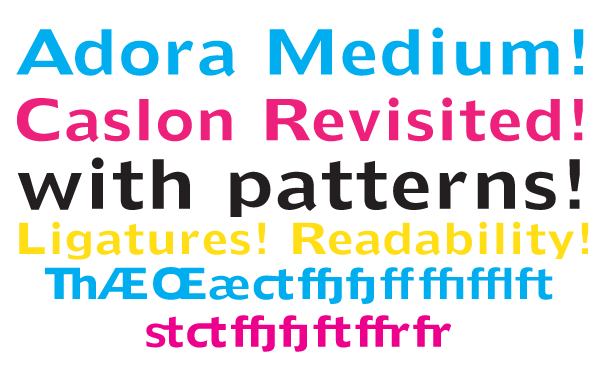
First up: Adora Medium.
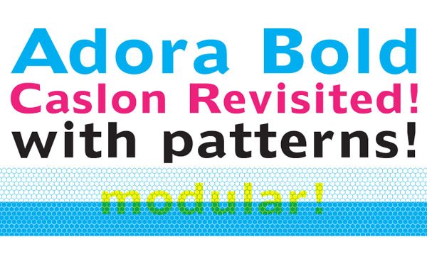
Adora Bold
Walter Tracy’s AdSans has been enjoying a resurgence in popularity over the past decade, in no small part from the digital revivals employed by Dutch designer Karel Martens. Adora is a revival of Tracy’s design, but with more attention paid to spacing and kerning for smooth text setting. It has a large x-height and reads well at small point sizes. A range of ligatures have been created for smooth text-setting and detailed display work. Two bonus modular pattern characters are included, custom-spaced so that designers can create seamless patterns to accompany typography using Adora, or to be used as a standalone design feature.
Both weights are available for immediate download from Wordshape and MyFonts.

Effete
Effete is a metropolitan titling typeface, similar in weight and proportion to fonts like Imre Reiner’s Corvinus, but both more expressive and less goofy. Available from Wordshape and MyFonts.

ASICS Kurihashi
May 30, 2011
ASICS Japanの一社員の生き方を収録したミニドキュメンタリー。