アイデア #347
August 5, 2011

オニツカタイガーのためにデザインした新しいフォント、Kirimomi GeometriおよびKirimomi Swashが、雑誌『アイデア』の最新号で特集されている。(この最新号の看板記事は、デザイナー、寄藤文平氏の作品概要となっている。素晴らしい!) 第347号は、このタイプフェイスの全キャラクター・セットを初めて完全に示し、それぞれのフォントの開発に関する長文のエッセイを日本語で掲載している。

Slanted #14
August 5, 2011

ドイツの雑誌『Slanted Magazine』の最新号に、2本の新しい随筆を寄稿した。ひとつは今は亡き日本人デザイナー、粟津潔氏の作品を振り返るもの、もうひとつは私の日本語書体についてのシリーズの第4弾で、今回は漢字そのものと漢字と仮名の併用による言語学的な変化と発展について記している。

『Slanted』は首都圏にお住まいの方であれば、渋谷Parco 2の地下にある洋書店Logosにてお買い求めいただける。

Design of Manga, Anime & Light Novels
August 5, 2011

室賀清徳氏と私がアイデアマガジンの新刊『漫画・アニメ・ライトノベルのデザイン』に寄せて書いた前書き。この本ではオタク層に向けたパッケージングやエディトリアルデザインの様々な試みを特集している。ご注文はこちらからどうぞ。

08.03.2011
August 3, 2011

I have chunk of work in the new book Logology 2: The Wonderland of Logo Design, published by Victionary.
The official blurb from the publisher:
Attending to an international audience overwhelmed by data and information, the new logo generation answers the urge for speed communication and recognition in both the physical and digital world. More than just a mark to differentiate between producers in a crowded market, logos today embrace efficiency and flexibility to fit extensive applications and take on a new significance to intrigue, explain and instruct. Can its making be as simple as it looks?

Displaying more than 1600 logos from 500 designers worldwide, Logology® 2 systematically contrasts the principle theme, structure, composition and palette of the world’s latest logo designs under 78 classes. It pictures a wonderland of logotypes, graphic icons, mascots and trademarks that have taken on a new significance to intrigue, explain and instruct as corporate logos, signs, favicons or decorations on the internet or in the real world. Alongside the tremendous showcase are 15 case studies where selected designers walked us through their creative process for the branding and rebranding of businesses, public bodies and non-profits. Branding experts, Frédéric Vanhorenbeke from Coast Design and Holger Jacobs at Mind Design, have shared their views and experiences respectively in the forewords for this book.
08.03.2011
August 3, 2011

Just finished our first big project for Google. No, we can’t talk about it. Yes, we are indebted to the folks who brought us on board!
08.02.2011
August 2, 2011

The past two weeks found me traveling to Kobe to shoot a handful of spots for Onitsuka Tiger, following ASICS/Onitsuka Tiger Europe’s digital content producer (and all around awesome dude!) Mutaurwa Mapondera as he interviewed five influential individuals from the brand’s history.

His first interview was with Mr. Uetsuki, the original head of Marketing and Promotions for Onitsuka Tiger. Super-interesting guy with lots to say and amazing sketches for logos, product concepts and the thickest pile of passports from his years of crossing the globe promoting the brand.
Mutaurwa is documenting our time together exploring Onitsuka Tiger’s history and legacy on his blog. Recommended reading!
07.29.2011
July 29, 2011
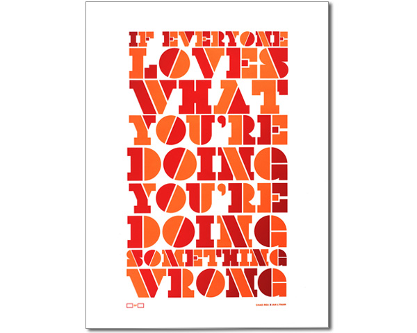
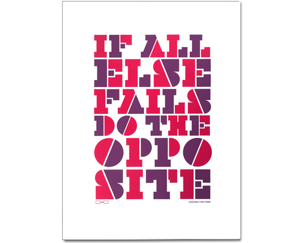
I just teamed up with copywriter extraordinaire Chad Rea to produce a new trio of posters for Electricity Showroom, a brand spanking new poster retailer out of Portland. Each is printed in two colors, limited edition and signed by us.
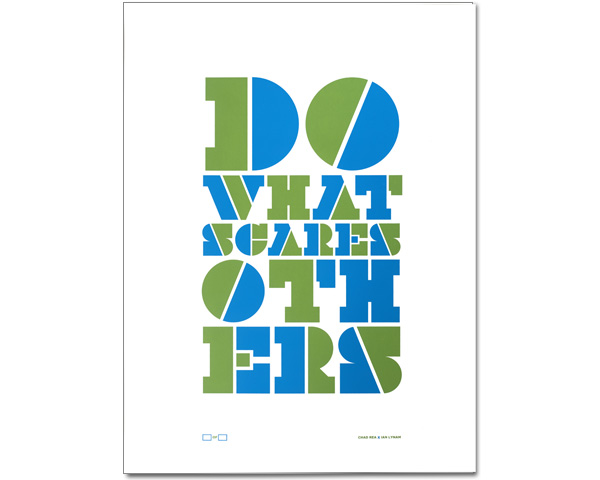
100% pure typography. Uncoated paper. Hand-pulled.
07.22.2011
July 22, 2011

So, due to some wackiness, the name of the free fonts created for Onitsuka Tiger were changed from Kihachiro Geometric Sans and Kihachiro Swash to Kirimomi Geometric Sans and Kihachiro Swash a few days after launch. The dust is settled and the fonts are currently burning up the charts over at MyFonts, where they are available for FREE!
07.13.2011
July 13, 2011

I’m happy to announce that my type foundry Wordshape has also partnered with Fontspring and our fonts will be available from them soon!